Useful for laying content in a 2D grid
- Usually used together with flexbox
- https://appbrewery.github.io/grid-vs-flexbox/
- https://appbrewery.github.io/gridgarden/
- when you shrink, everything lines up with each other on a column and row basis
- Tracks
- We have row tracks and column tracks, which we usually size them using
grid-template-columnsandgrid-template-rows
- We have row tracks and column tracks, which we usually size them using
- Cell
- The intersection of the units (each box)
- smallest unit in a grid, are different sizes
- you can use multiple cells to create a grid item!!
- Grid lines
- horizontal + vertical lines
- can control these using the gap property to specify its height or width
- When we write code, it places all these elements (the grid lines, the tracks, the cells), then grid fills in the grid from the start
Grid Sizing
.container {
	display: grid;
	grid-template-columns: 1fr 2fr; /* using ratio */
	grid-template-columns: 200px 200px; /* using absolute values*/
	grid-template-rows: 1fr 1fr;
	gap:10;
}- CSS Grid assumes the number of rows and columns based on
grid-template-columnsandgrid-template-rows. - fixed values aren’t responsive
Using auto
.container {
	display: grid;
	grid-template-rows: 100px auto;
	grid-template-columns: 400px auto;
}grid-template-rows- 1st row will have height of 100px, and auto will just try to fit the content for the 2nd row based on its size
gtid-template-columns- 1st column will have width of 400px, 2nd column will fit the rest of screen
Using fractions
.container {
	display: grid;
	grid-template-rows: 1fr 2fr; /* 1st row is half size of 2nd row */
	grid-template-columns: 1fr 2fr;
}
Using minmax
.container {
	display: grid;
	grid-template-rows: 1fr 2fr; /* 1st row is half size of 2nd row */
	grid-template-columns: 200px minmax(400px, 800px);
}- we define the minimum and the maximum width
Using repeat
.container {
	display: grid;
	grid-template-rows: repeat(2, 200px); /* repeat 200px 2 times */
	grid-template-columns: repeat(2, 100px);
}
Using auto
.container {
	display: grid;
	grid-template-rows: repeat(2, 200px); /* repeat 200px 2 times */
	grid-template-columns: repeat(2, 100px);
	grid-auto-rows: 300px;
}- takes care of the remaining elements that are not within the grid repeat
Using grid-template
.container {
	display: grid;
	grid-template: 100px 200px / 400px 800px;
	/* grid-template-rows + grid-template-columns */
}grid-template- shorthand property that combines
grid-template-rowsandgrid-template-columns. - For example,
grid-template: 50% 50% / 200px;will create a grid with two rows that are 50% each, and one column that is 200 pixels wide.
- shorthand property that combines
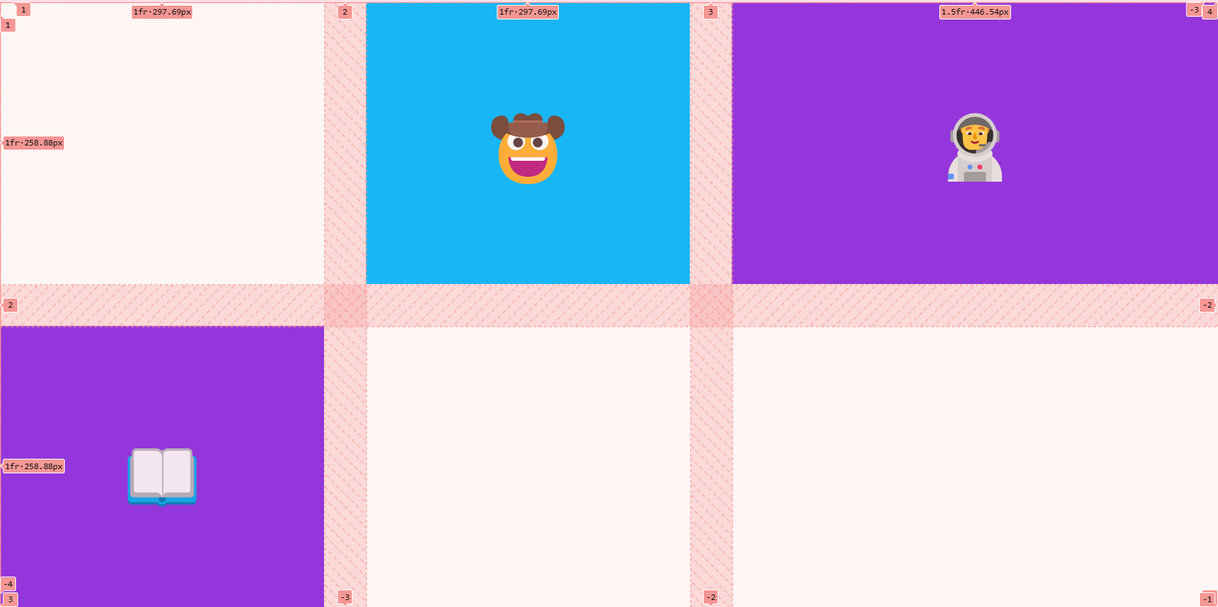
Grid Item Placement
- centering the items of each cell in grid using flex box
    <style>
      .container {
        height: 100vh;
        display: grid;
        gap: 3rem;
        grid-template-columns: 1fr 1fr 1.5fr;
        grid-template-rows: 1fr 1fr;
      }

      .item {
      /* using flex in each item of grid!!*/
        display: flex;
        justify-content: center;
        align-items: center;
      }
</style>-
you can also use fixed values in between
grid-template-columns: 50px 1fr 1fr 1fr 50px
-
making an element span 2 columns/rows
.item {
  /* using flex in each item of grid!!*/
	grid-column: span 2;
}
grid-column: span 2is actuallygrid-column-start: span 2grid-column-end: auto;
grid-column: 2grid-column-start: 2grid-column-end: auto;
- You can use these negative values (specified across each row/column)
grid-areagrid-area: 2 / 1 / 3 / 3- contains
grid-row-start, grid-column-start, grid-row-end, grid-column-end
- you can also position items on top of each other in the grid