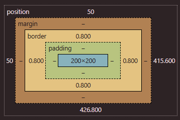
Overview
Content, Padding, Border, Margin
- Everything displayed in CSS is a box
- Diagram
- Website to experiment: https://appbrewery.github.io/box-model/
h1 {
	width:100px;
	height:100px;

	/* having no border ONLY on the top */
	border:10px solid black;
	border-top:0px;
}
h2 {
	border:10px solid black;

	/*top, right, bottom, left (clockwise) */
	border-width:0px 10px 20px 30px;

	/*x-values (top,bottom) and y-values (L&R) */
	border-width: 5px 5px;

	padding: 20px
}
Content box
Padding box
- PUSHES THE BORDER OUT from the element!!
- adds space between the element and the border
- commonly used with text
Border box
- surrounds the padding box, its space is defined by the
bordervalue - goes outwards and not inwards → Height/width of the element itself does not change
- Default border color is the current computed
text-colorvalue - Properties
border:10px solid black;- The main shorthand:
border-width+border-style+border-color
- The main shorthand:
border-style- Dotted, dashed, solid, double, etc (there’s a lot)
- Browsers may render borders differently so you many want to test them
border-*-style, likeborder-top-styleis possible
border-width- Default is
medium, others includethinandthick, etc
- Default is
border-radius- Rounds corners of box, can be more specific with
border-top-right-radius, etc - Or you can use this shorthand:
border-radius: 1em 2em 3em 4em;(top left, top right, bottom right then bottom left) - Or another shorthand for a corner
- Border radius is actually split into 2 parts: vertical/horizontal sides
border-top-left-radius: 1em→ setting the top-left-top radius AND the top-left-left radius to be1emborder-top-left-radius: 1em 2em;→ you can define BOTH properties (it will be stretched out elliptically)
- You can also divide elliptical and standard values with
/border-radius: 95px 155px 148px 103px / 48px 95px 130px 203px;- enables complex shapes lol
- Rounds corners of box, can be more specific with
- Logical properties, like block flow and inline flow
border-inline-end: 2px solid red;- This means that in left-to-right languages—like English— the red border will be on the right side of the box. In right-to-left languages—like Arabic— the red border will be on the left side of the box
- Border images
- You can use any type of image for borders
- allows you to set the source image, how that image is sliced, the image width, how far the border is outset from the edge and how it should repeat
.my-element {
  /* can also include CSS gradients */*
  border-image-source: url(https://assets.codepen.io/174183/border-image-frame.jpg);
  border-image-slice: 61 58 51 48;
  /* width of your border image */
  border-image-width: 20px 20px 20px 20px;
  /* distance between border image and the box that it wraps around */
  border-image-outset: 0px 0px 0px 0px;
  border-image-repeat: stretch stretch;
}border-image-slice- allows you to slice an image into 9 parts, made up of 4 split lines
- MDN docs
Margin box
- outside the border, defined by the box’s
marginrole- don’t affect the size of the box
- properties that occupy this space include
outline,box-shadow - They collapse, meaning they don’t add on top to each other but overlap. The bigger number takes place.
Tip
border-width, padding, margin- 4 values → all sides clockwise (top, right, bottom, left)
- Ex)
margin: 10px 20px 30px 40px
- Ex)
- 2 values → top/bottom and left/right
- Ex)
margin 10px auto
- Ex)
- 1 value → for all sides
- ex)
border-width: 4px 5px
- 4 values → all sides clockwise (top, right, bottom, left)